
Updated April 4, 2024, at 9:52 AM
Your website is one of the most important marketing tools to help deliver success and credibility to your business.
It’s the backbone of your online presence, digitally representing you day in and day out. Whether you’re starting from scratch or refreshing an existing one, let these financial services website design tips assist you through the process of creating an effective and engaging website to meet your business objectives.
Financial Services Website Design Tips
1. User Experience & User Interface
When it comes to a user experience (UX) or user interface (UI), first impressions matter.
Visitors can form an opinion about your financial services website in just 50 milliseconds. That’s all the time a user needs to decide whether your site is worth staying on or whether they should leave.
Even so, many users spend less than 15 seconds on a given site. If you haven’t generated interest in that amount of time, you likely never will. Making it critical to have a well-designed, well-functioning site.
Simplicity
Two of the many reasons why users may visit your financial services website are either to complete a certain action or to find an answer to whatever it is they’re looking for.
You want to make it as simple as possible for them to accomplish what they’re trying to get done. Any design elements should reinforce your website’s message and provide clear answers to the reasons the viewer landed on your site.
Hierarchy
Organize website elements in a natural but defined way. By varying your colors, font sizes, structure, and so forth, you can attempt to pull users towards the most important aspects of your financial services website.
Think about these four simple tips:
- Your financial services website should be easy to scan.
- Offer visual weight to your most important website elements.
- Consider natural eye-scanning patterns.
- Don’t limit users’ conversion paths.
Navigability
Make it easy for users to find what they’re looking for to get from point A to point B without having to think too much about it. Here are some website navigation tips to consider:
- Keep only essential options in the top-level navigation and use familiar words. Psychology suggests you should have no more than seven options.
- Include second navigation in the footer section of your site.
- Add a breadcrumb menu to make navigation between pages easier.
- Include a search bar in your website’s header so visitors can keyword search.
- Keep your site’s architecture as flat as possible. Users should never be more than three clicks away from what they’re looking for.
- Make your “Contact Us” page super easy to find and consider using a different color or button design for it. (But make sure it’s also included in your site’s footer.)
Related: 5 Signs You’re Doing it All Wrong Online
Uniformity
Try to keep the same look and feel across all pages of your site. This doesn’t mean every page has to look identical, but there should be consistent, uniform layouts depending on the type of page.
Accessibility & Responsiveness
Your website must be responsive and accessible. Ensure website pages are compatible across all browsers and devices. All of your site’s content, including images and videos, should be properly formatted to work across these different types.
Additionally, make sure your site is ADA-compliant and abides by the Web Content Accessibility Guidelines (WCAG), which ensures that people with disabilities or impairments can use and navigate your site.
Conventionality
There are basic website design conventions that people expect. These expectations include having the main navigation at the top of the page, having a logo at the top left or center of a page, and having a clickable logo that links to your homepage.
You may want your web design to be unique, but you shouldn’t stray too far from these normal conventions. People like familiarity. Going too far outside of that can be confusing for a user and could detract from their overall experience on your site.
Credibility
Be honest. Don’t over-promise and under-deliver. Don’t be deceitful. Be upfront about what you’re offering and the value behind it. If people can’t find it on your site, they’ll find it somewhere else.
User-Centricity
Your site should be designed for the end-user, not yourself. Every decision that you make for your site should be done with that in mind. Test your design elements, analyze data, see what’s working or not working, and adjust accordingly.
2. Website Design Elements & Branding
White Space
When it comes to the design of your financial services website, white space—also known as blank space or negative space—is a good thing. It brings harmony and balance while delivering a direct message to users. Don’t look at it as wasted space but instead see it as a way to lead users from one element to another.
Color
There’s no doubt that the color scheme should align with your brand. This helps with brand recognition across various mediums. However, don’t use too many colors or you’ll convey too many feelings and messages at one time, which can confuse the user. Keep it to a few colors and keep it consistent across the site. You want to achieve the right balance.
Fonts
Use a maximum of three fonts: one for main headings, one for sub-headings, and one for body text. Sans-serif fonts are typically better for web and web accessibility, such as Arial, Helvetica, Trebuchet MS, and Verdana.
Be aware of the font size and its impact on legibility. You don’t want your text to be too large or too small. It’s usually recommended to use font size 16 for the body text so that it’s more likely to be ADA compliant. Although there’s no official ADA minimum font size for websites, it’s highly recommended to not go below font size 12.
Related: Why Financial Professionals Should Go Mobile [Infographic]
3. Conversion Paths
Lead Forms
Each webpage should include a form and you should use a variety of form types throughout your site. These could include:
- Contact forms: Used for visitors to ask a question or send a message to you or your business’s main email. Be sure this form includes fields for their name, phone number, email, and the message itself.
- Lead generation forms: Convert visitors into leads with this form type. These forms should at least require a name and email address. The call-to-action (more on this in a bit) could be something like Schedule Appointment, Subscribe to Our Newsletter, or Download eBook.
- Registration forms: Use these to attract visitors and leads to register for an event or service you offer. These forms (for example, Register for Webinar or Attend Workshop) should also include at bare minimum a name and email address.
Make sure the purpose of your forms is clear and direct. Your headers should be straightforward so that visitors and leads know exactly how to fill out the form.
Keep your form clean and concise with minimal text. Try to limit the number of required fields so that users are more likely to complete the form. Lastly, try to include thank you messages, make sure any auto-responders are working properly, and confirm that their data is properly being sent to your database.
Call-to-Action Buttons
Call-to-action (CTA) buttons are an essential part of any financial website. They tell your visitors what actions you want them to take, whether it’s signing up for your newsletter, registering for an event, or contacting you to schedule an appointment.
They’re important for two reasons: to generate lead conversions and to increase your click-through rate.
Links
On your financial services website, links serve a number of purposes:
- As a means of navigation.
- As a method of promotion.
- To help build trust.
- And, as a way to reference other web pages.
Internal links (or links that go to other pages on your site) are a great SEO tool to help your search engine rankings, but they should be used naturally and periodically. They also help users navigate your site better. These links should never open in new browser tabs, but rather the existing tab the user is on.
It’s also critical to restrict the number of text links on each page. Too many links can make it difficult for users to navigate. Think beyond linking to your pages that are already in your main navigation, and instead, use links to pages deeper in your website’s hierarchy to create easier ways for users to find them. And when you’re creating internal link text, don’t overthink it. Clearly identify and describe the target of the link in the text itself.
Here are a few more pointers to keep in mind about links on your financial website:
- Make your links relevant and timely (don’t link just to link)
- Be sure you use “follow links” so that your links can flow freely to other internal pages
- Make sure your links contrast your other text so users know the text is clickable takes them to another page
- Double-check all links to make sure they’re working properly to avoid 404 error pages
Related: 8 Effective Lead Conversion Tips for Financial Professionals
Images
As humans, we’re wired to think visually, so the use of images throughout your site is helpful. Just be mindful not to crowd them onto pages. Images should be used sparingly, serve a purpose, and make an impact.
Here are four tips for images on your website:
- Only use high-resolution photos and keep the file sizes to a minimum without compromising quality. This contributes to a faster loading speed.
- Always include image alt-text that describes in detail what the image is about. This plays an important factor in image accessibility to visually impaired readers and also for on-page SEO.
- Photos of people are known to keep site visitors engaged and can help them connect with you and your business. Try to limit the use of stock photos whenever possible. Instead, use photos that match your brand and portray authenticity so that users will view your company as more legitimate.
- Ensure that rights to images have been properly licensed or cited. Use a credible source to purchase photos. There are strict copyright laws, which means you can’t simply pull photos from anywhere on the web.
Content
Identify your why. What’s your story? What’s your unique value proposition? Incorporating this into the content of your site will help demonstrate authenticity and build trust with the user. Make it compelling!
You should also choose keywords and key phrases that you’d like to target on your site. Instead of only targeting highly competitive keywords, you’ll see a greater return on investment if you focus on less competitive, long-tail, specific key phrases.
Your site should include information that includes your keywords but be careful not to “stuff” your site. Your content should be written for humans (not robots) and should add substantial value to your users.
Regularly updating your site with fresh, keyword-focused content will improve its overall performance and help drive organic traffic. So, when writing content for your site, make sure it’s:
- Free of spelling and grammatical errors
- Written with your target client in mind
- Relevant and up-to-date
- Void of industry jargon and slang
- Not used from other sources
- Properly cited, if needed
- Concise and easy to read
As a financial professional, your website should offer multiple types of content and conversion opportunities for visitors at each stage of the inbound marketing funnel.
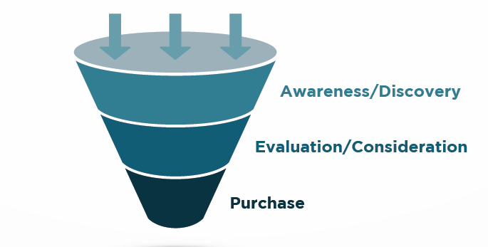
Top of the Funnel: Awareness & Discovery
A prospect is trying to solve a problem, meet a need, or get an answer to a question. In this stage, you should create content designed to educate, like:
- Blog posts
- eBooks
- Whitepapers
- Educational videos
- Educational courses
Middle of the Funnel: Evaluation & Consideration
A prospect looks for the best solution and often compares your service to others in the market. In this stage, you want to demonstrate how and why your solution is the right fit. Your goal should be to nurture the leads and establish trust. This is also the stage where you can determine if this prospect is a good fit for you as well. You can utilize content types such as:
- FAQ sections
- Expert guides
- Webinars
- Toolkits
- Reports
- Quizzers
Bottom of the Funnel: Purchase
An engaged prospect is ready for that next step but continues to look for more information before they make the decision to become your client. In this stage, these content types serve best:
- Case studies
- Testimonials
- Events
Related: Content Marketing for Advisors: How to Promote One Piece of Content
Analytics
Web analytics are essential to all websites. These tools monitor your site’s traffic to help you identify successes and opportunities to drive strategy and improve a user’s experience.
Decide which analytics platforms, such as Google Analytics, that you’ll be using on your site. Even if you don’t check your analytics every week, it’s important to have the ability to look back and see your website’s traffic habits. It can be valuable information when making future decisions on your site—and your business as a whole.
Legal & Security
By law, your financial website should have a privacy policy that explicitly lays out the type of data and personal information being collected on the site. Contact your broker-dealer and/or legal team for state-specific verbiage. Once created, add a link to this in the footer. Here are more legal and security issues to be aware of for your site:
- If you do business in California, make sure your site abides by the California Consumer Privacy Act (CCPA) guidelines.
- A financial professional’s website should also include a “Terms of Use” page to protect your website assets. This should be added as a link in the footer of your main page.
- If your site is designed to track cookies, consider adding a banner to your site so visitors understand how their information is being used.
- Make sure your website abides by the WCAG guidelines.
Last Point
A website is your online conversation starter.
Not only can it help raise brand awareness, but it can dramatically increase sales and bring new revenue streams to your business. We encourage you to use the information presented in this post to maximize your online presence. And we’re here to help you achieve success in all aspects of your business.
Keep Reading: Shift into Marketing Gear: Tips for Committing to Your Marketing Strategy
The information provided above is for general informational purposes only and does not, and is not intended to, constitute legal advice. Consult with your compliance officer or legal team in regard to these important website practices and applicable laws.